样式技巧
阻止 input 聚焦
使用 @mousedown.prevent 阻止默认事件
<el-input type="text"/>
<el-button type="primary" @mousedown.prevent>点击</el-button>
设置优先级
importance = "high" 如果是 js 文件使用 preload
<img src="/bigBg.png"width="400"height="500" importance="high" />也可以使用 fetchpriority 有效值 有 high low auto
fetchpriority 属性可以与 link、script、img 以及 iframe 标签一起使用,该属性允许我们在使用这些标签加载资源(例如:样式资源、字体资源、脚本资源、图像资源和 iframe)时指定优先级。
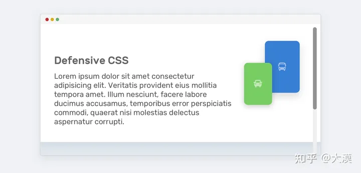
min-width / min-height 代替 width / height
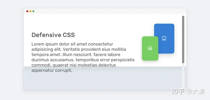
为了避免内容超出容器,我们需要使用 min-height 来替代 height:
.hero {
    min-height: 350px;
}
使用 width 如果文本过长会溢出 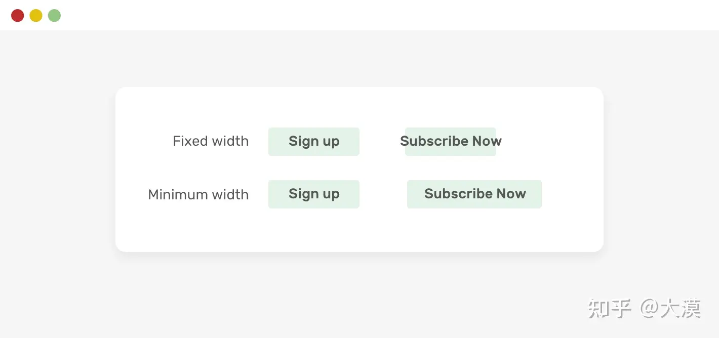 把 width 换成 min-width 就不会出现这种现象了:
.button {
min-width: 100px;
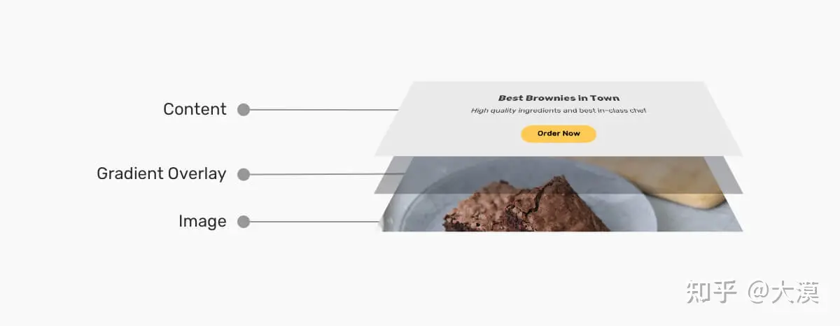
}图片上的文字
很多场景中,文字会出现在图片之上:
大多数的时候,开发者都会考虑在文本和图片之间增一个层,这个层可能是一个纯色层,也能是一渐变层,也可能是一个带有一定透明度的层,为增加文本的可读性
Card Title
Some des will go here and I need it to wrap into lines
Card Title
Some des will go here and I need it to wrap into lines
Card Title
Some des will go here and I need it to wrap into lines
Card Title
Some des will go here and I need it to wrap into lines
Card Title
Some des will go here and I need it to wrap into lines
Card Title
Some des will go here and I need it to wrap into lines
Card Title
Some des will go here and I need it to wrap into lines
Card Title
Some des will go here and I need it to wrap into lines
Card Title
Some des will go here and I need it to wrap into lines
Card Title
Some des will go here and I need it to wrap into lines
Card Title
Some des will go here and I need it to wrap into lines
Card Title
Some des will go here and I need it to wrap into lines
background
渐变
TIP
渐变本质是一个图片,可以实现图片的效果
background-clip
padding-box / border-box
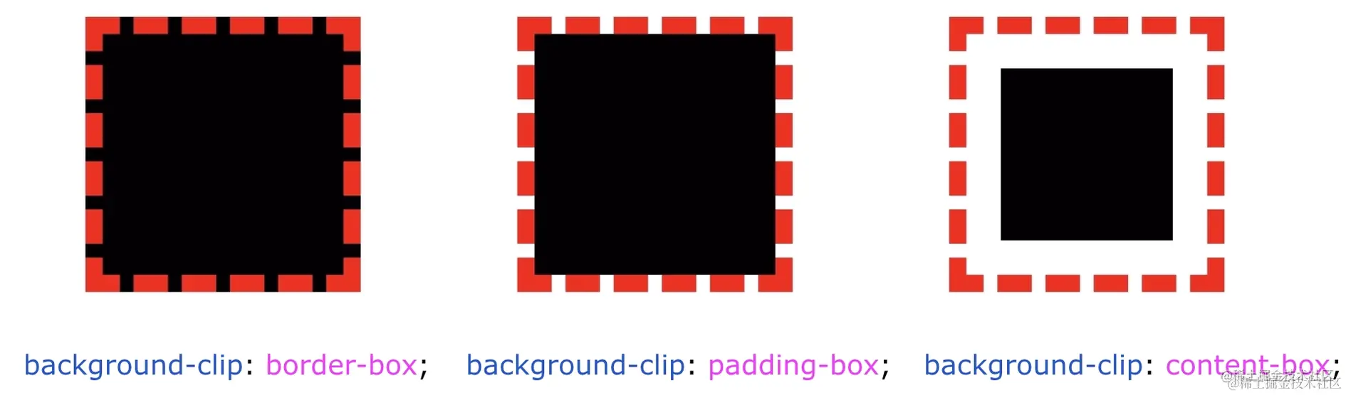 实现一个红黄相间的边框 1. 利用 border-style: dashed 设置一个虚线边框; 2. 利用 background-clip: border-box 让背景色从边框处开始绘制; 3. 再设置第二重背景色,利用 background-clip: padding-box 让这重背景色从 padding 处开始即可。
 div {
width: 100px;
height: 100px;
background: linear-gradient(#fff, #fff), #e91e63;
background-clip: padding-box, border-box;
border: 5px dashed #ffeb3b;
}技巧点在于使用 padding-box 填充 linear-gradient 因为 backgound 只可以使用一种颜色,但是 linear-gradient 是一个图片
background-clip: text
以区块内的文字作为裁剪区域向外裁剪,文字的背景即为区块的背景,文字之外的区域都将被裁剪掉
div {
  color: transparent;
  background-clip: text;
}
但是 linear-gradient 也算是背景图片
div {
    font-size: 54px;
    color: transparent;
    background: linear-gradient(45deg, #ffeb3b, #009688, yellowgreen, pink, #03a9f4, #9c27b0, #8bc34a); // [!code fl]
    background-clip: text;
}background 与 display: inline
那就是 background 在 display: inline 和 display: block 下的不同表现。
<style>
p, a {
background: linear-gradient(90deg, blue, green);
}
</style>
<p>Lorem .....</p>
<a>Lorem .....</a>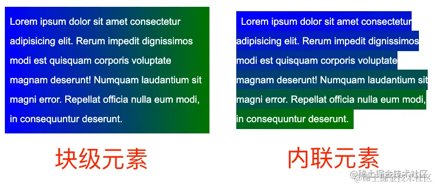 加上动画
加上动画 p, a {
color: #000;
background: linear-gradient(90deg, blue, green);
background-size: 100% 100%;
background-repeat: no-repeat;
transition: all 1s linear;
}
p:hover ,
a:hover {
background-size: 0 100%;
}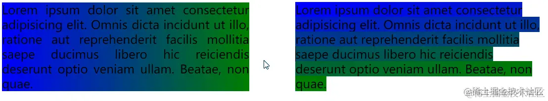
多行文本的渐隐消失
<p>
  <a>Mollitia nostrum placeat consequatur deserunt velit ducimus possimus commodi temporibus debitis quam
  </a>
</p>p {
position: relative;
width: 400px;
}
a {
background: linear-gradient(90deg, transparent, transparent 70%, #fff);
background-repeat: no-repeat;
cursor: pointer;
color: transparent;
&::before {
content: "Mollitia nostrum placeat consequatur deserunt velit ducimus possimus commodi temporibus debitis quam";
position: absolute;
top: 0;
left: 0;
color: #000;
z-index: -1;
}
}文字 hover 动效
<p>Lorem ipsum dolor sit amet consectetur adipisicing elit. <a>Mollitia nostrum placeat consequatur deserunt velit ducimus possimus commodi temporibus debitis quam</a>, molestiae laboriosam sit repellendus sed sapiente quidem quod accusantium vero.</p>a {
background: linear-gradient(90deg, #ff3c41, #fc0, #0ebeff);
background-size: 0 3px;
background-repeat: no-repeat;
background-position: 0 100%;
transition: 1s all;
color: #0cc;
}
a:hover {
background-size: 100% 3px;
color: #000;
}我们虽然设定了 background: linear-gradient(90deg, #ff3c41, #fc0, #0ebeff),但是一开始默认它的 background-size: 0 3px, 也就是一开始是看不到下划线的,当 hover 的时候,改变 background-size: 100% 3px,这个时候,就会有一个 0 3px 到 100% 3px 的变换,也就是一个从无到有的伸展效果
Mollitia nostrum placeat consequatur deserunt velit ducimus possimus commodi temporibus debitis quam, molestiae laboriosam sit repellendus sed sapiente quidem quod accusantium vero.
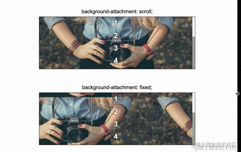
background-attachment
scroll 与 fixed,一个是相对元素本身固定,一个是相对视口固定,有点类似 position 定位的 absolute 和 fixed
视差滚动
滚动阴影
结合 srcoll 与 local,实现一种伪滚动阴影
初始没有滚动的时候是没有阴影展现的,只有当开始滚动,阴影才会出现。
TIP
在滚动初始的时候,利用两层背景叠加在一起隐藏阴影背景,真正滚动的时候,将叠加的部分移走,只漏出阴影部分即可
在开始的时候,使用 attachment:locale 挡下阴影部分,在滚动的时候,attachment:locale 会自己移开,使用 attachment:scroll暴露出阴影
- AAAAAAAA AAAA
- BBBBBBBB CCCC
- DDDDDDDD DDDD
- AAAAAAAA AAAA
- BBBBBBBB CCCC
- DDDDDDDD DDDD
- AAAAAAAA AAAA
- BBBBBBBB CCCC
- DDDDDDDD DDDD
- AAAAAAAA AAAA
- BBBBBBBB CCCC
- DDDDDDDD DDDD
clip-path
该属性使用裁剪方式创建元素的可显示区域。区域内的部分显示,区域外的隐藏。
语法
.div{

  clip-path: url(resources.svg#c1);

  clip-path: inset(100px 50px);

  clip-path: circle(50px at 0 100px);

  clip-path: polygon(50% 0%, 100% 50%, 50% 100%, 0% 50%);

  clip-path: path('M0.5,1 C0.5,1,0,0.7,0,0.3 A0.25,0.25,1,1,1,0.5,0.3 A0.25,0.25,1,1,1,1,0.3 C1,0.7,0.5,1,0.5,1 Z');
}
clip-path 的局限性
只有图形的最右侧展示了边框。这是因为,clip-path 其实是切割图形,边框其实是作用在原本的整个 div 之上的

使用 filter: drop-shadow() 创建阴影
box-shadow 盒阴影的作用是在整个元素的后方创建阴影,而 drop-shadow() 滤镜则是创建一个符合元素本身形状(alpha 通道)的阴影。使用多层阴影
<style>
.father {
height: 100px;
width: 200px;
margin: auto;
filter:drop-shadow(0 0 .5px #000)
drop-shadow(0 0 .5px #000)
drop-shadow(0 0 .5px #000)
drop-shadow(0 0 .5px #000)
drop-shadow(0 0 .5px #000)
drop-shadow(0 0 .5px #000)
drop-shadow(0 0 .5px #000);
}
.children {
height: 100%;
clip-path: polygon(40% 0%, 40% 20%, 100% 20%, 100% 80%, 40% 80%, 40% 100%, 0% 50%);
background: #ff5722;
}
</style>
<div :class="clipPath.father">
<div :class="clipPath.children"></div>
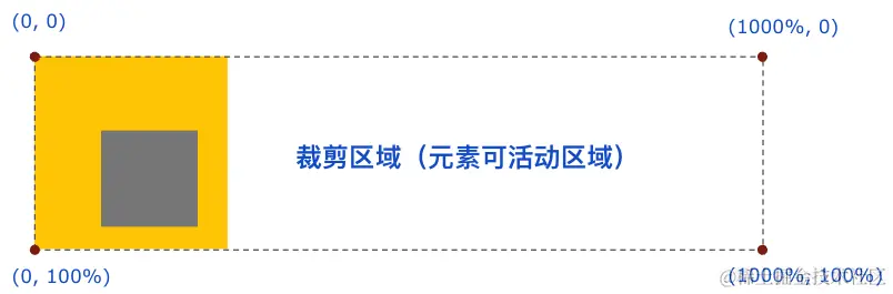
</div>利用 clip-path 实现指定区域的 overflow:hidden
使用 clip-path,可以实现任意方向上的空间裁剪!其控制内容的溢出裁剪的能力比 overflow: hidden 还要强大
div{
    // 只允许右侧可以溢出的容器
    clip-path: polygon(0 0 ,1000% 0, 1000% 100%, 0 100%);

   // 裁剪出左边、上边、右边都 overflow:hidden,下边不 overflow: hidden 的区域
    clip-path: polygon(100% 0,100% 1000%, 0 1000%, 0 0);
}
基于 clip-path 的边框动画
clip-path 可以设置 border-radiusdiv {
position: relative;
}
div::before {
content: "";
position: absolute;
top: 0;
left: 0;
right: 0;
bottom: 0;
border: 2px solid gold;
border-radius: 5px;
animation: clippath 3s infinite linear;
}
@keyframes clippath {
0%,
100% {
clip-path: inset(0 0 95% 0);
}
25% {
clip-path: inset(0 95% 0 0);
}
50% {
clip-path: inset(95% 0 0 0);
}
75% {
clip-path: inset(0 0 0 95%);
}
}<style lang="scss" scoped module="clipPathBorder2">
.div1 {
position: relative;
margin: auto;
width: 120px;
line-height: 64px;
text-align: center;
color: #fff;
font-size: 20px;
border: 2px solid gold;
background: gold;
transition: all .3s;
cursor: pointer;
&::before,
&::after {
content: "";
position: absolute;
top: -10px;
left: -10px;
right: -10px;
bottom: -10px;
border: 2px solid gold;
transition: all .5s;
animation: clippath 3s infinite linear;
border-radius: 10px;
}
&::after {
animation: clippath 3s infinite -1.5s linear;
}
}
@keyframes clippath {
0%,
100% {
clip-path: inset(0 0 98% 0);
}
25% {
clip-path: inset(0 98% 0 0);
}
50% {
clip-path: inset(98% 0 0 0);
}
75% {
clip-path: inset(0 0 0 98%);
}
}
</style>
<div :class="clipPathBorder2.div1">Hello</div>基于 clip-path 的动态区域裁剪动画
通过改变 clip-path 来动态改变显示区域
<style lang="scss" scoped module="clipPathBorder2">
.container {
    position: relative;
    width: 400px;
    height: 300px;
    margin: auto;
    overflow: hidden;
    cursor: pointer;
    transition: clip-path .3s linear;
    clip-path: circle(20px at 44px 44px);
    @apply bg-green-300;

    &:hover {
        clip-path: circle(460px at 44px 44px);
    }
}

ul {
    position: absolute;
    line-height: 32px;
    top:50px;
    padding-left: 50px;
    font-size: 18px;
    list-style: none;

    li:hover {
        color: deeppink;
    }
}
</style>

<div :class="clipPathBorder3.container">
    <ul>
        <li>11111</li>
        <li>22222</li>
        <li>33333</li>
        <li>44444</li>
    </ul>
</div>- 11111
- 22222
- 33333
- 44444
box-shadow
立体阴影
立体投影的关键点在于利于伪元素生成一个大小与父元素相近的元素,然后对其进行 rotate 以及定位到合适位置,再赋于阴影操作
颜色的运用也很重要,阴影的颜色通常比本身颜色要更深,这里使用 hsl 表示颜色更容易操作,l 控制颜色的明暗度
<style scoped module="shadow">
.div {
    position: relative;
    width: 600px;
    height: 100px;
    margin: 5vmin auto 15vmin;
    background: hsl(48, 100%, 50%);
    border-radius: 20px;
    box-shadow: 0 0 5px 2px hsl(48, 100%, 45%);
}

.div::before {
    content: "";
    position: absolute;
    top: 50%;
    left: 5%;
    right: 5%;
    bottom: 0;
    border-radius: 10px;
    background: hsl(48, 100%, 20%);
    transform: translate(0, -15%) rotate(-4deg);
    transform-origin: center center;
    box-shadow: 0 0 20px 15px hsl(48, 100%, 20%);
    z-index: -1;
}
</style>

<div :class="shadow.div"></div>
新拟态风格阴影
<style lang="scss">
  .div {
    box-shadow:
        7px 7px 12px rgba(0, 0, 0, .4),
        -7px -7px 12px rgba(255, 255, 255, .9);
}

.div:nth-child(2) {
    box-shadow:
        inset -7px -7px 12px rgba(255, 255, 255, .9),
        inset 7px 7px 12px rgba(0, 0, 0, .4);
}

.div:nth-child(3) {
    transition: .2s all;
    box-shadow:
        7px 7px 12px rgba(0, 0, 0, .4),
        -7px -7px 12px rgba(255, 255, 255, .9),
        inset 0 0 0x rgba(255, 255, 255, .9),
        inset 0 0 0 rgba(0, 0, 0, .4);

    &:active {
        box-shadow:
            0 0 0 rgba(0, 0, 0, .4),
            0 0 0 rgba(255, 255, 255, .9),
            inset -7px -7px 12px rgba(255, 255, 255, .9),
            inset 7px 7px 12px rgba(0, 0, 0, .4);
    }
}
</style>

<div class="flex gap-4">
  <div :class="boxShadow1.div">浮雕阴影</div>
  <div :class="boxShadow1.div">浮雕阴影</div>
  <div :class="boxShadow1.div">浮雕阴影</div>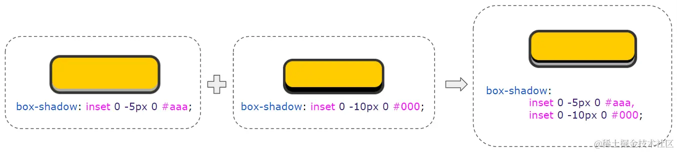
</div>彩色阴影 / 渐变阴影
利用阴影模拟多层边框
利用阴影可以复制自身的能力
最先定义的阴影优先级最高,然后依次递减。.div {
margin: 50px auto;
width: 200px;
height: 100px;
background: deeppink;
box-shadow:
inset 0 0 0 6px #fff,
0 0 0 10px green,
0 0 0 15px orange,
0 2px 5px 15px yellow
}
.div2 {
width: 200px;
height: 64px;
margin:auto;
background: #fc0;
border-radius: 20px;
box-shadow:
inset 0 -5px 0 #aaa,
inset 0 -10px 0 #000;
}
backdrop-filter
- filter:模糊滤镜的作用是将模糊或颜色偏移等图形效果作用于元素之上。
- backdrop-filter:该属性可以在元素后方区域,添加上模糊或颜色偏移等图形效果。backdrop-filter 的生效范围是元素背后的所有内容,因此,为了能够看到效果,元素或其背景至少要保持部分透明。
图片的蒙版 Hover 效果
filter
利用模糊滤镜提取图片主题色
利用模糊滤镜提取图片主题色
.filter{
  position: relative;
  width: 320px;
  height: 200px;
  margin: auto;
  overflow: hidden;
  &::before {
    content: "";
    position: absolute;
    top: 0;
    left: 0;
    right: 0;
    bottom: 0;
    background: url("../assets/img/blurBackground.png");
    background-size: cover;
    filter: blur(50px);
    transform: scale(3);
  }
}
直角变成圆角
嘴角的弧度是通过 border-bottom 的 border-radius 实现的
然后通过 filter: contrast(20) 对嘴角进行弧度处理
.filter {
    position: relative;
    margin: auto;
    width: 250px;
    height: 250px;
    filter: contrast(20);
    background-color: #fff;
    overflow: hidden;

    &::before {
        content: "";
        position: absolute;
        top: 0;
        left: 0;
        bottom: 0;
        right: 0;
        filter: blur(7px);
        border: 25px solid transparent;
        border-bottom: 25px solid #000;
        border-radius: 50%;
    }
}