基础 css 属性
权重
内联:1000
id:100
class,属性,伪类:10
标签,伪元素:1
* : 0
替换元素
如果只有替换元素的 vertical-align 是没有 baseline 的,没有基线概念
如果还有文字的话,文字的基准是 baseline 替换元素是 bottom,所以底部会有空白出现
伪元素(Pseudo-elements)
before / after
设置宽高
⭐ after 或者 before 是默认是 inline 模式,同时必须要有 content, 需要设置为 inline-block 才可以设置宽高
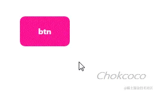
例子
使用一个元素无法完成完整样式的绘制,需要额外的元素
<style>
  .pop {
      position: relative;
      width: 200px;
      height: 100px;
      background: #e91e63;
      border-radius: 8px;
  }

  .pop::after {
      content:"";
      position: absolute;
      top: 45px;
      left: -24px;
      width: 0;
      height: 0;
      border: 12px solid;
      border-color: transparent #e91e63 transparent transparent;
  }
</style>

<div class="pop"/>
当元素无具体语义时,与宿主又属于同一主体进行展示

<style>
  div {
      position: relative;
      width: 100px;
      height: 48px;
      background: blue;
      border-radius: 10px;
  }

  div::before {
      content: "";
      position: absolute;
      background-image: url(icon.png)
  }
</style>
<div>分享</div>
增强元素的交互体验,又不想额外添加元素
.btn::before{
  content:"";
  position:absolute;
  top:-10px;
  right:-10px;
  bottom:-10px;
  left:-10px;
}
伪元素的 content
content
⭐ ::before 和 ::after 伪元素想要生效,一定要有 content 元素,至少需要设置 content: ' '。
<style>
div::before {
  content: attr(data-content);
}
</style>

<div data-content="EDF">ABC</div>content 的动画
<style scoped module="before1">
  .p {
      position: relative;
  }

  .p::after {
      content: "";
      position: absolute;
      top: 0;
      bottom: 0;
      animation: dot 3s infinite steps(3, start);
  }

@keyframes dot {
    33.33% {
        content: ".";
    }
    66.67% {
        content: "..";
    }
    100% {
        content: "...";
    }
}
</style>

<p :class="before1.p">加载中</p>
加载中
没有伪元素的元素
<img> 、 <input>、 <iframe> 不能包含其他元素,所以不能通过伪元素插入内容
但是 img 失效后可以使用伪元素
<style>
img.error {
    position: relative;
    display: inline-block;
}

img.error::before {
    content: "";
    background: url( error-default.png );
}

img.error::after {
    content: attr(alt)
};

</style>
<img src="test.png" alt="图片描述" onerror="this.classList.add('error');">
伪类(Pseudo-classes)
⭐
可以理解为 伪装的class
伪类则是用于选取当前元素的 某个状态或属性,并且这个状态不能通过普通选择器选择到。
例如:hover、:link、:visited、:active等。
伪类可以选择不同状态的内容,比如链接不同状态下的颜色等。伪类也可以应用于元素之外,例如 :first-child 可以选择某个元素的第一个子元素。
伪元素与伪类的区别
- 伪元素是用来表示选中某一元素内部的子元素,并在这些子元素上添加样式;而伪类是用来表示元素的状态,并在元素处于该状态时添加样式。
- 伪元素能够创建一些不存在于文档结构中的元素,而伪类只是改变已经存在的元素的表现形式。
- 伪元素通常使用 :: 两个冒号, 伪类单个冒号进行表示
选择器
:is
表示存在,一定要正确的表述关系.a 与 .a1 是交集选择器(即…又…), .a后面不能有空格
<style>
.a:is(.a1, .a2) {
  height: 100px;
  width: 100px;
  background-color: red;
}
</style>
<div class="a a1"></div>
<div class="a a2"></div>:not
/* class a 但是不含有 b */
.a:not(.b)
 /* 悬浮过去 但是不含有 isNotCurrentMonth 标签 */
.cellData:hover:not(.isNotCurrentMonth) //<!--黄色-->
<div class="css-a"></div>
<!--紫色-->
<div class="css-a css-b"></div>
<style>
.css-a {
width: 100px;
height: 100px;
background-color: rebeccapurple;
&:not(.css-b) {
background-color: yellow;
}
}
</style>实际效果
<div class="cellData"></div>
<div class="cellData isNotCurrentMonth"></div>

<style lang="scss" scoped>
  .cellData {
    width: 100px;
    height: 100px;
    background: yellow;
    &:hover:not(.isNotCurrentMonth) {
      background-color: rebeccapurple;
    }
  }
</style>
first-child
可以看做一个交集选择器,.a:first-child可以看做是 .a 并且是 first-child<div>
<div :class="child.a">a</div>
<div :class="child.a">a</div>
<div :class="child.a">a</div>
</div>
<style module="child">
.a:first-child{
color:red
}
</style>选择位置
前面是
相当于是 正则的正向先行检查
<div class="icon">icon</div>
<span>span</span>

<style>
  /* 选择span */
  .icon + span {
    color: red;
  }
</style>后面是
<div class="icon">icon</div>
<span>span</span>

<style>
  /* 选择span */
  .icon:has(+span) {
    color: orange;
  }
</style>里面有
<div class="icon">icon <span>aaa</span> </div>

<style>
  /* 选择icon */
	/* 这个是只要是子元素就可以 */
  .icon:has(span){
    color: yellow;
  }
 /* 必须是直接子元素 */
  .icon:has(>span){
    color: yellow;
  }
</style>
不为空
<div class="icon">icon <span>aaa</span> </div>

<style>
  /* 选择icon */
.icon:not(:empty){
  color: red;
}
</style>
复合类选择器
<span class="a a1">span</span>

<style>
.a+.a1 {
  color: red;
}
</style>
属性
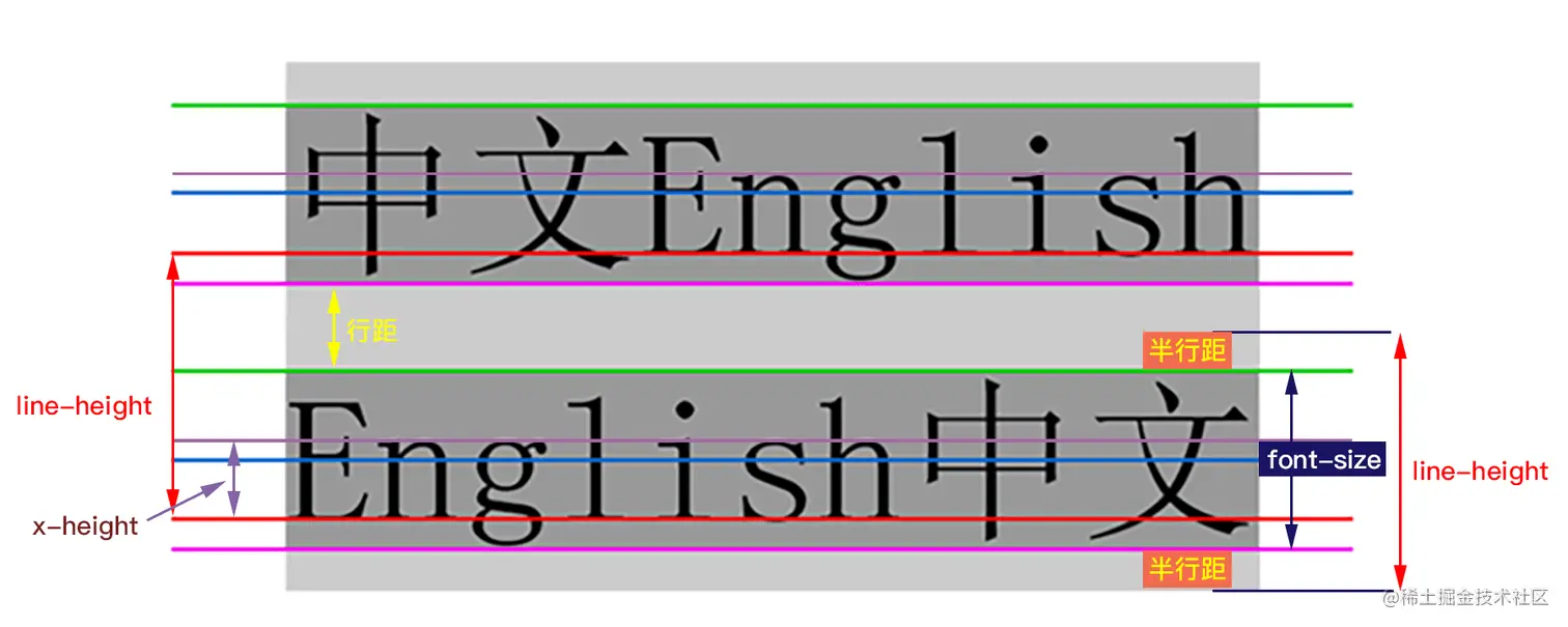
vertical-align
vertical-align 用来指定行内元素(inline)或表格单元格(table-cell)元素的垂直对齐方式。
不能用它垂直对齐块级元素。 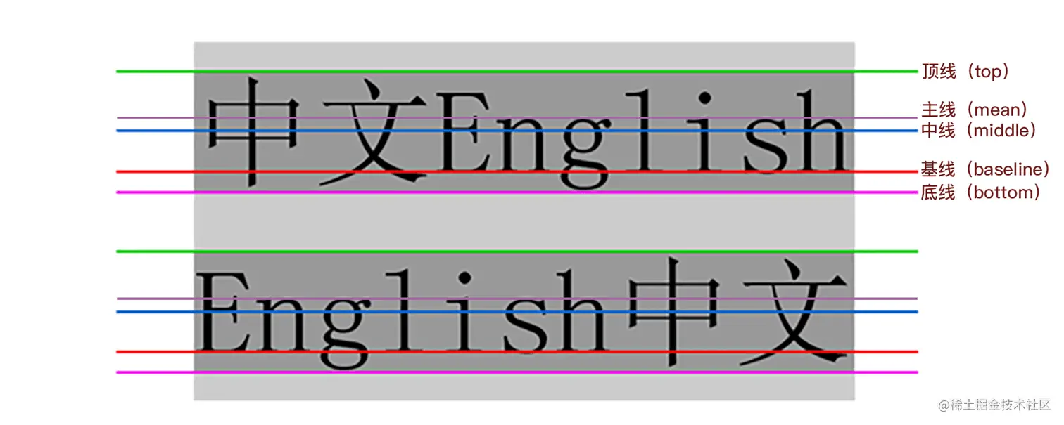
相对父元素的值
这些值使元素相对其父元素垂直对齐
- baseline 使元素的基线与父元素的基线对齐。
- text-top 使元素的顶部与父元素的字体顶部对齐。
- text-bottom 使元素的底部与父元素的字体底部对齐。
- percentage 使元素的基线对齐到父元素的基线之上的给定百分比,该百分比是line-height属性的百分比。可以是负数。
line-height
order 改变元素位置
<ul>
  <li style="--bg:red" >1</li>
  <li style="--bg:green"> 2</li>
  <li style="--bg:yellow">3</li>
</ul>

<style>
  ul{
    display: flex;
  }

  li{
    margin: 10px;
    color: var(--bg);
  }
  /*  本应该在 最后面*/
  li:nth-child(2){
    order: -1;
  }
</style>- 1
- 2
- 3
transition
transition 基础讲解
transition: transform 1s linear 0s
- transition-property:过渡属性,指定应用过渡属性的名称;
- transition-duration:过渡持续时间,指定过渡动画持续的时间;
- transition-timing-function:过渡缓动,指定过渡动画过程中的缓动函数;
- transition-delay:过渡延迟,指定过渡动画延迟多久才被触发。
支持多个属性的精细化控制
{
    // 可以单个属性
    transition: all 1s linear;

    // 可以多个属性
    transition:
        height 1s linear,
        transform 0.5s,
        color 2s ease-in-out 0.5s;
}
INFO
如果没有延迟时间,最后一个 0s 可以省去。
同理,过渡的缓动函数默认是 ease,如果希望缓动是 ease,则 ease 关键字也可以省略(ease:规定过渡先缓慢地开始,然后加速,然后缓慢地结束)
巧用多层元素,解决交互闪烁问题
<style>
  .g-circle {
   /* ... */
    transition: transform .3s;
  }
  .g-circle:hover {
    transform: translate(0, -20px);
  }
</style>
<div class="g-circle">Hello CSS</div>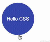
这是由于元素的初始态和 hover 状态下的终态,元素的位置发生了变化,中间存在 20px 高度差,当鼠标从下方 hover 上去的时候,触发了元素向上位移的过渡动画,元素在向上位移的过程中,鼠标很有可能会失去元素的焦点,导致元素失去 hover 状态,此时元素就会回归本位,在回归的过程中鼠标又能重新获得元素的焦点……如此反复,就导致了整个元素的抖动!
<style>

.g-circle {
    transition: transform .3s;
}

.g-container:hover .g-circle {
    transform: translate(0, -20px);
}

</style>
<div class="g-container">
    <div class="g-circle">Hello CSS</div>
</div>flex 与 inline-flex
他们的表现形式有点类似于 block 和 inline-block。
设置为 flex 容器,它的宽度和父容器等宽,即 width 为 100%,也称块 Flexbox 容器
设置为 inline-flex 容器,它的宽度是由其子元素(后代元素)的内容来决定,相当于 width 为 auto,也称内联 Flexbox 容器
TIP
display: flex; 相当于 display: block flex;
display: inline-flex; 相当于 display: inline flex;
<style>
  .app {
    width: 100px;
    height: 100px;
    background-color: green;
  }
</style>

<body>
  <div class="app">
    <span style="display: flex;height: 100%;background-color: red;"></span>  <!-- -->
  </div>

  <div class="app">
    <span style="display: inline-flex;height: 100%;background-color: yellow;">  <!-- -->
     abcd
    </span>
  </div>
</body>
重点关注他们的宽度, ⭐flex 的宽度和父容器一致,inline-flex的宽度和子容器的宽度一致
flex:1 与 width 的权重
flex:1 的权重比 width 权重更高
<style>
  .app {
    width: 100px;
    height: 100px;
    background-color: green;
  }

  .flex-item {
    flex: 1;
    width: 200px;
    background-color: aqua;
  }
</style>

<body>
  <div class="app">
    <div style="display: flex;
      flex-wrap: wrap;
      width: 500px;
      height: 100%;
      background-color: red;">
      <div class="flex-item"></div>
      <div class="flex-item"></div>
      <div class="flex-item"></div>
      <div class="flex-item"></div>
      <div class="flex-item"></div>
      <div class="flex-item"></div>
      <div class="flex-item"></div>
      <div class="flex-item"></div>
    </div>
  </div>
</body>
可以打开 f12 切换 flex:1 与 width,目前是 flex:1 在生效
flex 子元素设置宽度
当父元素的宽度固定时,想要发生滚动时,子元素设置宽度,但是子元素宽度没有生效
<style>
  .flex {
    display: flex;
    height: 300px;
    width: 300px;
    overflow: auto;
    gap:2px;
    margin: auto;
  }
  .child{
    width: 80px;
    background-color: red;
  }
</style>

<div class="flex">
  <div class="child"></div>
  <div class="child"></div>
  <div class="child"></div>
  <div class="child"></div>
  <div class="child"></div>
  <div class="child"></div>
  <div class="child"></div>
</div>flex-shrink(收缩) 默认是1,所以子元素设置了宽度,但是没有生效 要想子元素宽度生效, 把 flex-shrink 设置为 0
.child{
  width: 80px;
  flex-shrink: 0;
}
flex:1 不能保证大小相同
默认情况下,弹性 Flex 项目(设置为 flex:1 的 Flex 项目)在收缩的时候,其宽度不会小于其最小内容尺寸(即 min-width,也就是 max-content 或固定尺寸元素的长度)。
需要显式设置
min-width或min-height的值”。默认情况下,min-width(或min-height)的值为 auto,它会被计算为 0。当一个元素为Flex项目时,min-width或min-height的值会被计算为max-content。这就是会触发边缘的计算。
为此,要真正达到均分列,只显式设置 flex:1 还不行,还需要在 Flex 项目上显式设置 min-width 的值为0
<style>
  .property {
    display: flex;
  }
  span{
    flex: 1;
    min-width: 0;
  }
</style>

<body>
  <div class="property">
    <span>aaa</span>
    <span>aaaaaaaaaaaaaaaaaaaaaaaaaaaaaaaaaaaaaaaaaaaaaaaaaaaaaaaaaaaaaaaaaaaaaaaaaaaaaaaaaaaaaaaaaaaaaaaaaaaaaaaaaaaaaaaaaaaaaaaaaaaaaaa</span>
  </div>
</body>
这个是缺少 min-width:0 的效果
这个是添加 min-width:0 的效果
align-items / align-content
TIP
看名字也能分辨出来:
items 主要是控制里面的 item 在当前行的对齐方式
content 主要是控制 item 组成的内容的对齐方式
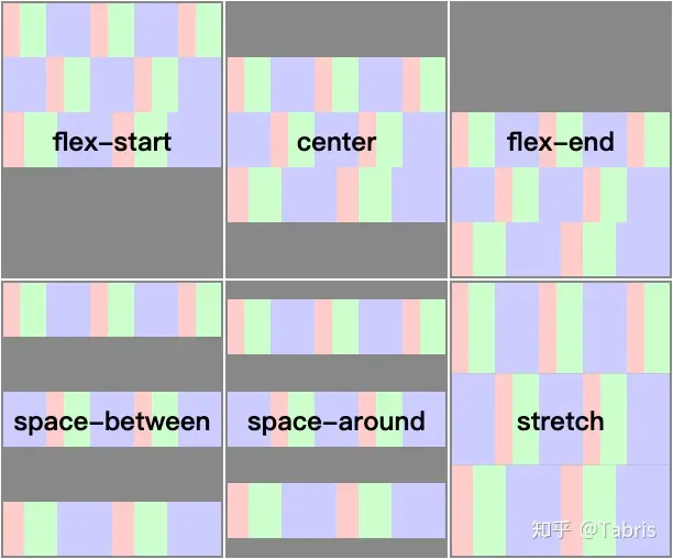
🔗align-content
当弹性容器在正交轴方向还存在空白时,该属性可以控制其中所有行的对齐方式
TIP
该属性对单行弹性盒子模型无效。(即:带有 flex-wrap: nowrap)。
取值
start
所有行从容器的起始边缘开始填充。center
所有行朝向容器的中心填充。每行互相紧挨,相对于容器居中对齐。容器的垂直轴起点边和第一行的距离相等于容器的垂直轴终点边和最后一行的距离。stretch
拉伸所有行来填满剩余空间。剩余空间平均地分配给每一行。space-between
所有行在容器中平均分布。相邻两行间距相等。容器的垂直轴起点边和终点边分别与第一行和最后一行的边对齐
🔗align-items
INFO
align-items 是默认值 stretch
如果成员的长宽是 auto ,而且容器内正交轴方向的两个边距都是 auto,那么成员将会被拉伸。成员将会尽可能的在正交方向上填满所在行
该属性可以控制弹性容器中成员在当前行内的对齐方式
align-items 的设置对象是行内成员
总结
- align-items 的上下文是行内,align-content 的上下文是弹性盒子容器;
- align-items 控制成员与当前行的对齐行为,align-content 控制所有行与容器的对齐行为。
align-items
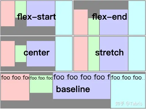
align-content
grid 与 inline-grid
- grid 创建的网格容器是块盒,网格容器的宽度和父容器宽度相等
- inline-grid 创建的网格容器是内联盒子,网格容器的宽度将由其具有最大宽度(max-content)的子元素(网格项目)来决定
.block-container {
    display: grid;
    /*相当于*/
    display: block grid;
}

.inline-container {
    display: inline-grid;
    /* 相当于 */
    display: inline grid;
}<body>
<div
style="display: inline-grid;
width: 200px;
height: 500px;
background-color: red;">
<div>首页</div>
<div>逛逛</div>
<div>购物车</div>
<div>222222222222222</div>
</div>
</body>如果是 display:inline-grid 宽度是子元素的最大宽度
如果是 display:grid 宽度是父级宽度
网格
默认情况下,网格项目是 Stretch(拉伸的)
轨道尺寸
- 带有不同单位的长度值,如 px、em、rem、%、vw 等,还有网格布局中独有的单位 fr
- 关键词,比如 none、auto、min-content 和 max-content
- CSS 函数,比如 fit-content()、minmax()、repeat()、min()、max()和 clamp()等
INFO
为了让你的 CSS Grid 更为灵活(适应性更强),在定义网格轨道的时候,应该尽可能的使用内在尺寸
即 使用关键词和 CSS 的函数
PC 端常见的两列布局,即 侧边栏固定宽度,主内容区域自适应。
 如果使用 CSS Grid 来布局的话,通常会像下面这样:
.container {
    display: grid;
    gap: 1rem;
    grid-template-columns: 250px 1fr;
    grid-template-areas: "sidebar main";
}
可以设置的更为灵活
.container {
    grid-template-columns: fit-content(250px) 1fr;
}
fit-content(250px) = min(min(max-content, 网格中的可用宽度), max(min-content, 250px))
这样的好处是根据可用空间自动匹配,最大不超过 250px,最小不小于 max-content(内容宽度)

<style>
  .container {
    display: grid;
    gap: 1rem;
    height: 200px;
    grid-template-columns: fit-content(250px) 1fr;
    grid-template-areas: "sidebar main";
  }

  .a {
    grid-area: sidebar;
    background-color: red;
    height: 100%;
  }

  .b {
    background-color: yellow;
    height: 100%;
    grid-area: main;
  }
  </style>

  <div class="container">
    <div class="a">
      Lorem ipsum dolor sit amet consectetur adipisicing elit. Iusto tempore corrupti nisi earum, temporibus numquam at debitis alias quae odit eligendi iure natus nulla provident est accusamus suscipit, ad ipsa
    </div>
    <div class="b"></div>
  </div>
如果有文字的话,宽度是文字的宽度,但是不会超过 250px
如果里面有元素设置了宽度,那么会以元素的宽度为准,可能会超过 250px
TIP
在 CSS Grid 布局中,定义网格轨道尺寸时,尽可能的不要使用外在尺寸(比如设置固定的长度值<length>),应该尽可能的使用内在尺寸(比如 min-content)
即使不使用内在尺寸,也应尽可能的结合 CSS 的函数(比如 min()、max()和 clamp()等),来提高网格轨道尺寸的灵活性和自适应性!
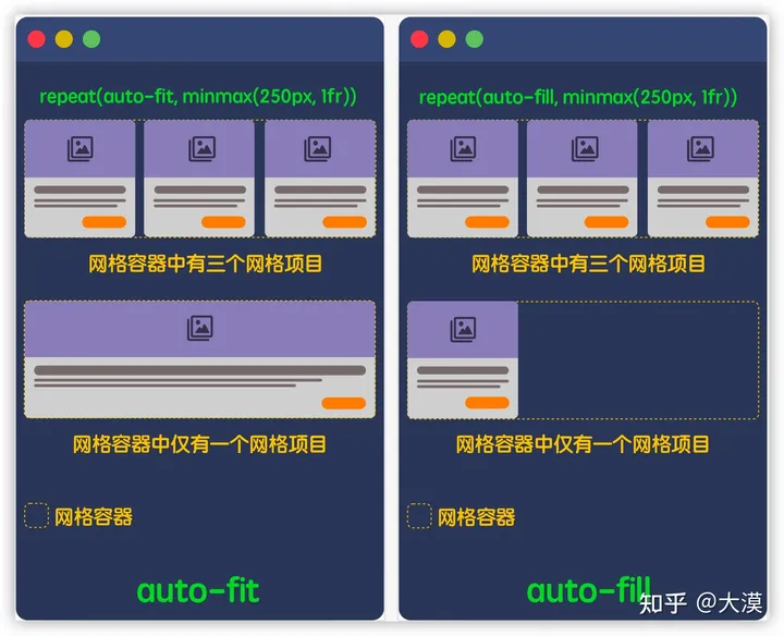
🚀auto-fill 与 auto-fit
- auto-fit 将扩展网格项目以填补可用空间
- auto-fill 不会扩展网格项目。相反,auto-fill 将保留可用的空间,而不改变网格项目的宽度
ℹ️从名字可以看出来, fit 是适应, fill 是填充
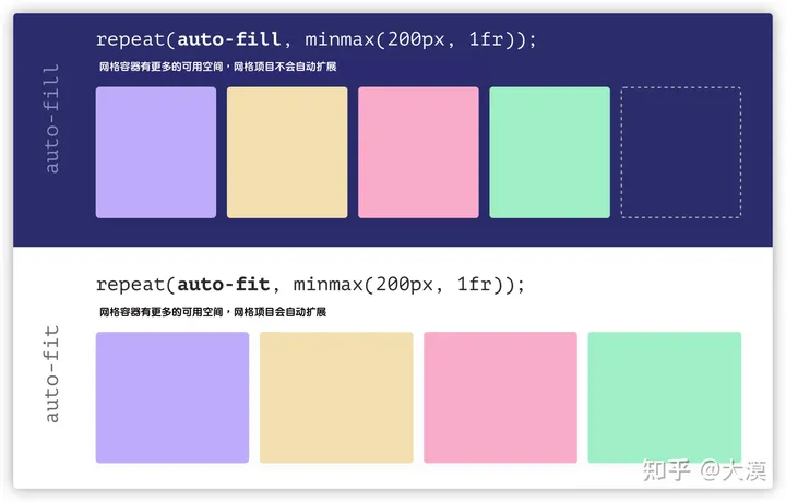
在网格容器中有多个和仅有一个网格项目时,使用 auto-fill 与 auto-fit 的差异:
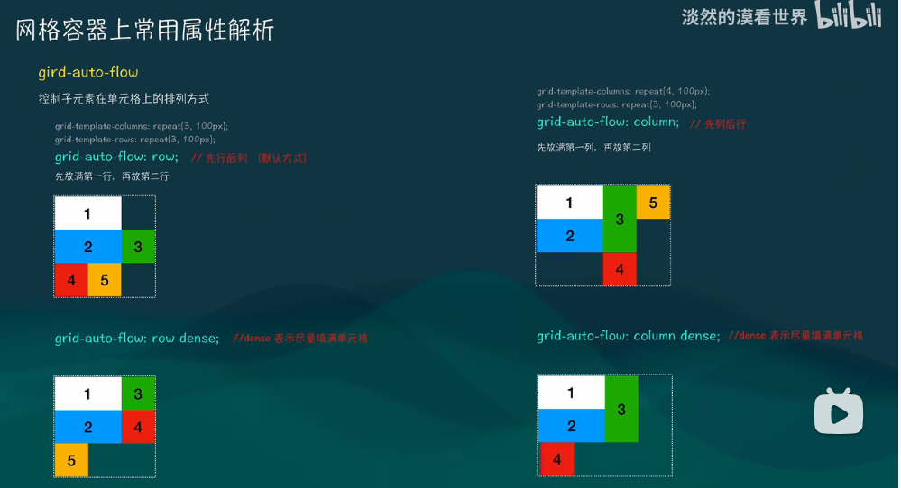
grid-auto-flow
控制子元素在单元格上的排列方式
align-content/justify-content
align-content控制网格行与容器的对齐方式 也就是没有指定单元格高度时justify-content控制网格列与容器的对齐方式
justify-content
start
end
stretch
stretch - 项目大小没有指定时,拉伸占据整个网格容器。 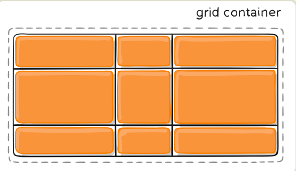
space-between
space-between - 项目与项目的间隔相等,项目与容器边框之间没有间隔。 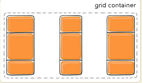
grid-auto-rows/grid-auto-columns
当子元素所在的行超过了我们指定的行数时,浏览器根据这个属性自动生成行高 
align-items/justify-items
align-items 垂直方向 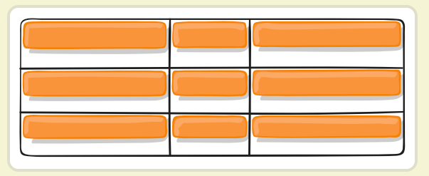
justify-items 水平方向 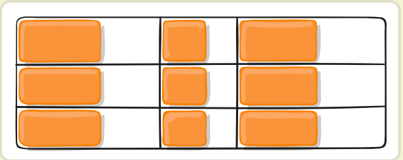
例子
<div :class="grid2.grid">
  <div>1</div>
  <div>2</div>
  <div>3</div>
  <div>4</div>
  <div>5</div>
  <div>6</div>
  <div>7</div>
</div><style>
.grid {
background: green;
height: 600px;
display: grid;
grid-template-columns: repeat(2, 100px);
grid-template-rows: repeat(4, 100px);
/*里面的子元素与单元格之间位置*/
align-items: flex-end;
/* 对行之间与容器之间的位置 */
align-content: space-between
}
.grid div {
/* 如果不限制宽度,并且 justify-content: center 会变成平铺 */
width: 50px;
height: 50px;
border: 1px solid black;
}
.grid div:nth-child(1) {
background: #ef3429;
}
.grid div:nth-child(2) {
background: #ffa500;
}
.grid div:nth-child(3) {
background: #669900;
}
.grid div:nth-child(4) {
background: #223472;
}
.grid div:nth-child(5) {
background: #990055;
}
.grid div:nth-child(6) {
background: #f0f0c0;
}
.grid div:nth-child(7) {
background: #e0dfcc;
}
</style>overscroll-behavior
锁定滚动链 overscroll-behavior
最常见的情景是你打开一个弹框(Modal)并向下滚动到底部(垂直方向)时,如果继续向下滚动则会引起弹框下方的内容(通常是 body 元素)会继续滚动。这也是滚动链默认的表现行为:
overscroll-behavior-y: contain; 可以让外层容器不滚动
<div style="
          overflow-y: auto;
          height: 200px;
          background-color: red;">
    <!-- 控制浏览器过度滚动时的表现——也就是滚动到边界。 -->
  <div style="
        height: 300px;
        background-color:antiquewhite;
        overscroll-behavior-y: contain;
        overflow-y: scroll;">
      <div
        style="height: 500px;
              background-color: aqua;">
      </div>
    </div>
  </div>
scroll-behavior
- scroll-behavior 实现平稳的滚动
- scroll-snap-type 如果它当前没有被滚动,这个滚动容器的可视视图将静止在临时点上。意思是当滚动动作结束,如果可能,它会临时在那个点上。
- scroll-snap-align(滚动捕捉对齐)
- start
- end
- center 当前元素的哪个位置与父元素对齐
<style>
  .container {
    width: 200px;
    height: 100px;
    overscroll-behavior: smooth;
    scroll-snap-type: x mandatory;
    overflow-x: auto;
    display: flex;
    flex-shrink: 0;
  }

  .child {
    min-width: 100%;
    height: 100%;
    scroll-snap-align: center;
    scroll-snap-stop: always;
  }

  .child:nth-child(odd) {
    background-color: blue;
  }

  .child:nth-child(even) {
    background-color: yellow;
  }
</style>
</head>

<div class="container">
  <div class="child"></div>
  <div class="child"></div>
  <div class="child"></div>
  <div class="child"></div>
  <div class="child"></div>
</div>
inset
inset: 0 就等同于 top:0; left: 0; right: 0; bottom: 0
也可以 inset: 2px 4px 6px 8px; /* 上 | 右 | 下 | 左 */
左右间距 :inset-inline:5% 10%
上下间距 :inset-block:5% 10%
mask
mask 译为遮罩。在 CSS 中,mask 属性允许使用者通过遮罩或者裁切特定区域的图片的方式来隐藏一个元素的部分或者全部可见区域
<style lang="scss" scoped module="basicMask">
    .mask{
      margin: auto;
      width: 500px;
      height: 250px;
      background: url("@img/maskYaSuo.webp") no-repeat;
      background-size: cover;
      mask: linear-gradient(90deg, transparent, #000);
    }
</style>

<div :class="basicMask.mask"></div>相当于带一个口罩,口罩可以是透明的,也可以是不透明,就是裁切样式
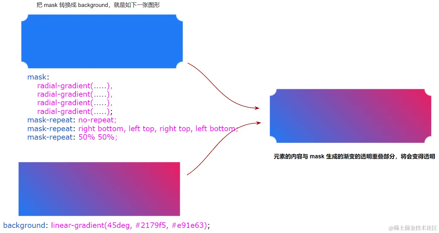
使用 mask 实现内切圆角图形
.circle {
  width:200px;
  height:120px;
  background: linear-gradient(45deg, #2179f5, #e91e63);
  mask: radial-gradient(
          circle at 100% 100%,
          transparent 0,
          transparent 12px,#2179f5 13px
      ),radial-gradient(
          circle at 0 0,
          transparent 0,
          transparent 12px,#2179f5 13px
      ),radial-gradient(
          circle at 100% 0,
          transparent 0,
          transparent 12px,#2179f5 13px
      ),radial-gradient(
          circle at 0 100%,
          transparent 0,
          transparent 12px,#2179f5 13px
      );
  mask-repeat: no-repeat;
  mask-position: right bottom, left top, right top, left bottom;
  mask-size: 70% 70%;
}
mask 实现渐变消失布局
Mask 的核心就是遮罩,遮挡住元素的内容(可以是部分挡住,可以是逐渐消失,甚至是可以分块挡住),显示出其元素背后的内容,如果是透明,可以显示后面内容
border-image
一张图片

.borderImage{
      height: 200px;
      width: 400px;
      margin: 0 auto;
      background-color: #000;
      border: 10px solid;
      border-image: url(https://www.w3schools.com/css/border.png) 30 round;
    }
其中 border-image: url(https://www.w3schools.com/css/border.png) 30 round; 是一个复合属性,分开的属性是:
border-image-sourceborder-image-sliceborder-image-repeat
border-image-slice 的切割原理 
四个角不变,中间部分默认被拉伸
如果不想中间部分不被拉伸,可以设置 border-image-repeat: repeat;,但是在末尾可能有截断情况,
可以设置 border-image-repeat: round;,动态平均分配拉伸宽度,没有截断
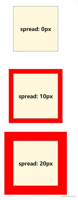
box-shadow
模糊半径
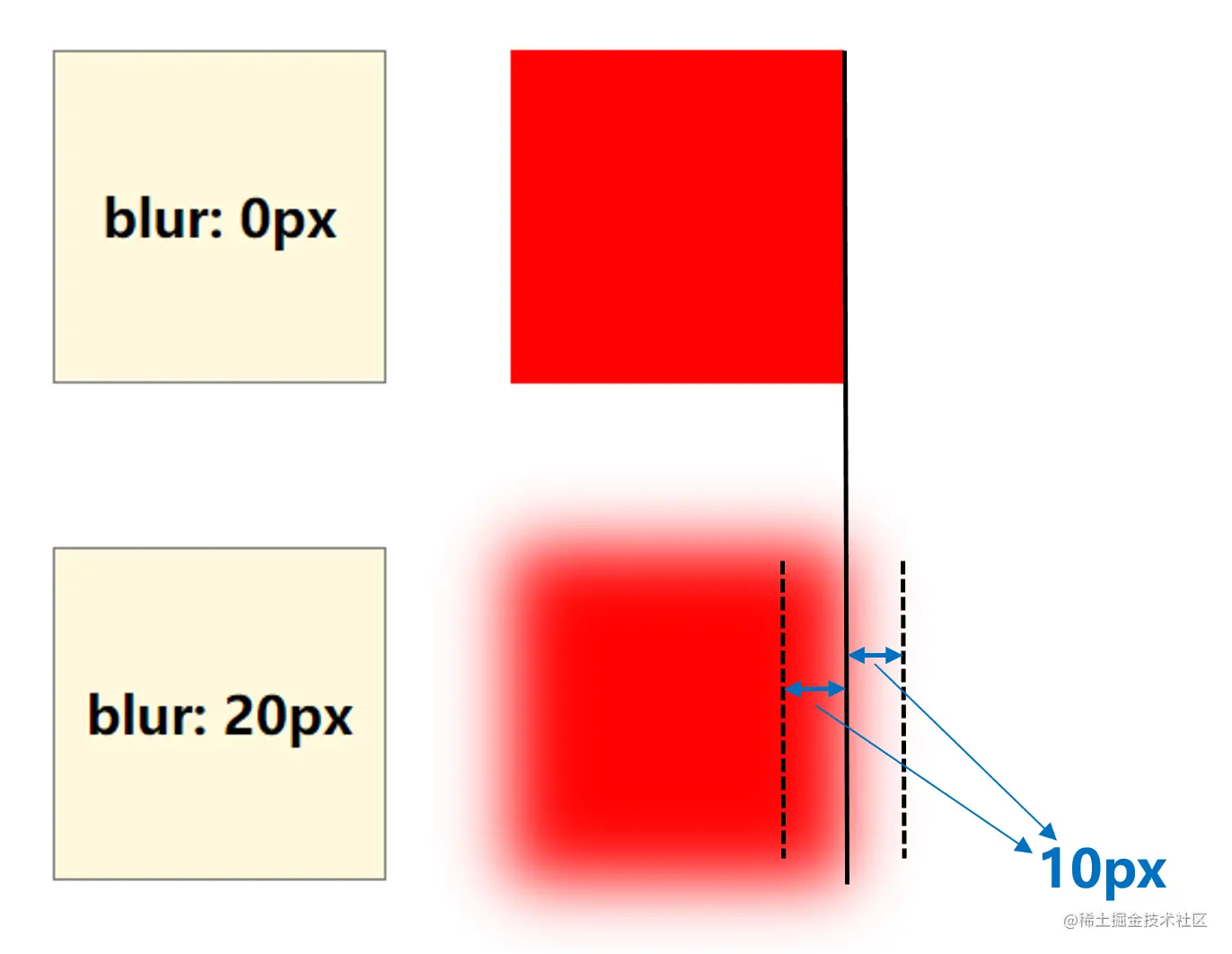
扩散半径
filter
 原始图片 filter: grayscale(1) filter: invert(.9); filter: brightness(.5); filter: saturate(6); filter: sepia(1); filter: blur(5px); filter: contrast(200%); filter: hue-rotate(45deg); filter: drop-shadow(16px 16px 20px blue); filter: opacity(.5);
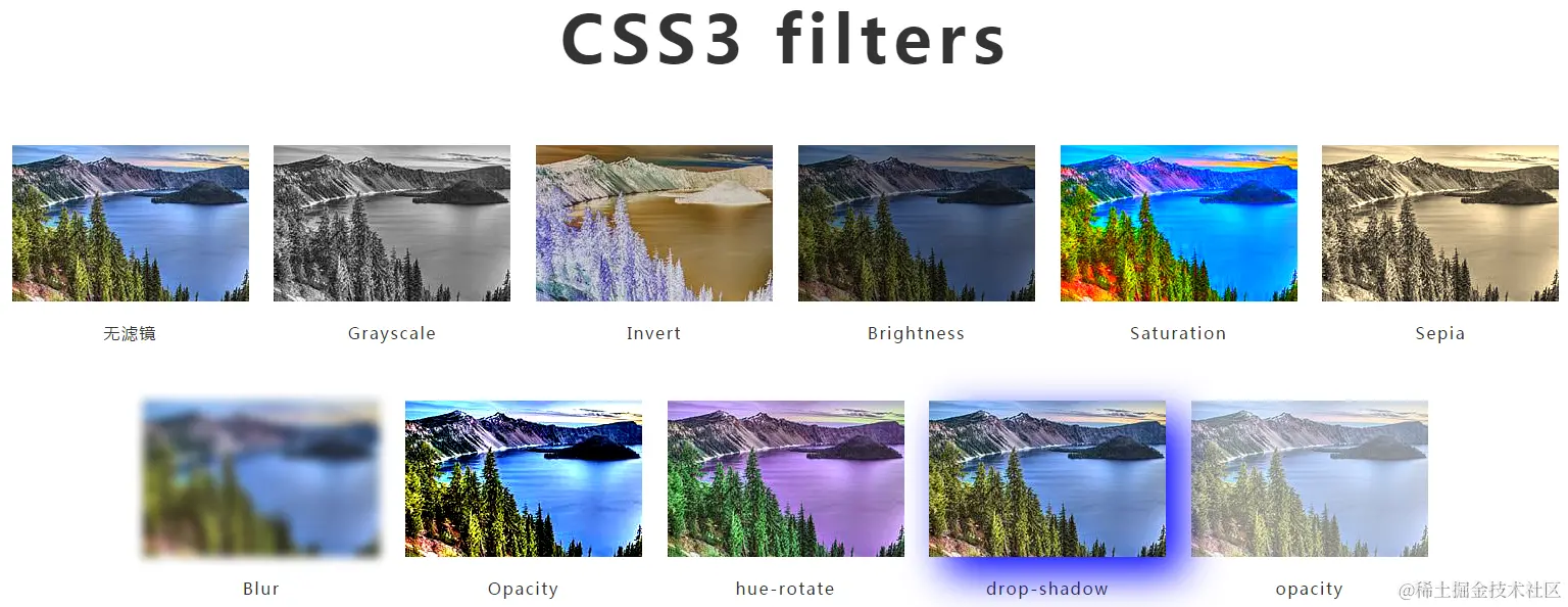
backdrop-filter
- filter 滤镜作用于当前元素,仔细理解这里的当前元素,并且它的后代元素也会继承模糊滤镜的效果;
- backdrop-filter 滤镜作用于元素背后区域的所有元素
ℹ️作用了 filter 和 backdrop-filter 的元素会使内部的 fixed 定位失效
TIP
通常,CSS 中的 position: fixed 是相对于屏幕视口进行定位的。但是,对于应用了 filter和 backdrop-filter 的元素,其内部的 position: fixed 元素将不再相对于屏幕视口进行定位,而是相对于 Backdrop Root 元素进行定位
<style>
  .container {
    width:10vw;
    height: 10vw;
    background: rgba(255, 100, 100, .8);
}

.fixed {
    position: fixed;
    top: 1vw;
    left: 1vw;
    right: 1vw;
    bottom: 1vw;
    background: rgba(100, 100, 255, .8);
}
</style>

<div class="container">
  <div class="fixed"> </div>
</div>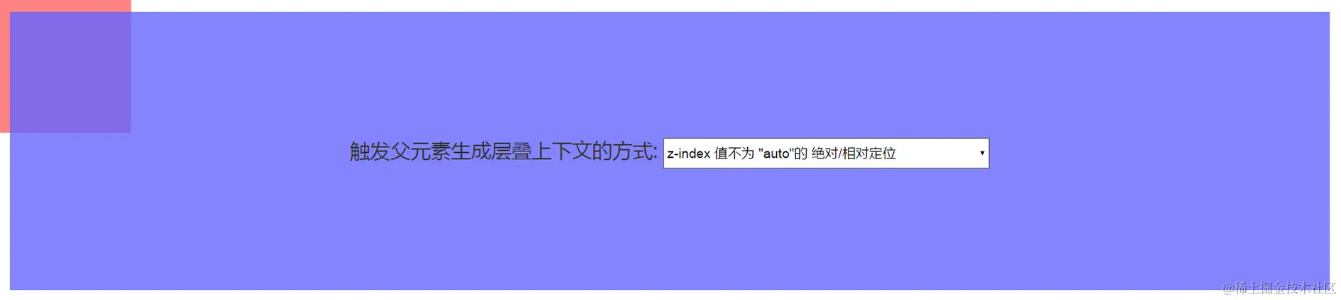
如果我们给父元素 .container 新增一个 filter: blur(1px),子元素的 fixed 定位就会退化成 position: absolute 定位
.container {
    width:10vw;
    height: 10vw;
    background: rgba(255, 100, 100, .8);
    filter: blur(1px);
}
在 CSS 中,目前一共有 7 种方式可以让元素内部的 position: fixed 基于该元素定位:
- transform 属性值不为 none 的元素;
- 设置了 transform-style: preserve-3d 的元素;
- perspective 值不为 none 的元素;
- 在 will-change 中指定了任意 CSS 属性;
- 设置了 contain: paint;
- filter 值不为 none 的元素;
- backdrop-filter 值不为 none的元素。
drop-shadow(投射阴影)
box-shadow 与 drop-shadow 区别

语法层面 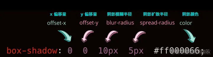
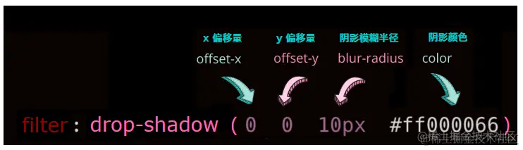
- box-shadow 有内阴影,内阴影使用关键字 inset 进行描述,而 drop-shadow 是没有内阴影的;
- box-shadow 多一个阴影扩散半径参数,drop-shadow 是没有阴影扩散半径参数的。
- 都支持多重阴影
混合模式
混合模式的核心就是:描述当元素重叠时,颜色应当如何呈现
使用场景- 两个图层或者元素之间希望产生交互作用,形成一些特殊效果
- 两个图层或者元素重叠后,想改变 / 隐藏元素中特定部分的颜色,譬如基于一张图片 / ICON,得到不同颜色的其他颜色的效果
- 文本与背景非常规展示,譬如创建独特的文本效果,又或者是譬如让文字在不同背景下都能产生强烈的反差效果
利用混合模式实现单张 ICON 的颜色控制技术
/* $img : "https://user-images.githubusercontent.com/8554143/34239266-232bdfc0-e641-11e7-8792-408782aaa78e.png"; */

.pic{
    margin: 10px;
    text-align: center;
    font-size: 24px;
    height:100%;
    background-size: cover;
    background-repeat: no-repeat;
    color: #fff;
    background-image: url($img);
}

.pic1 {
    background-image: url($img), linear-gradient(#f00, #f00);
    background-blend-mode: lighten;
}

.pic2 {
    background-image: url($img), linear-gradient(yellowgreen, yellowgreen);
    background-blend-mode: lighten;
}

.pic3 {
    background-image: url($img), linear-gradient(#f00, #00f);
    background-blend-mode: lighten;
}box-decoration-break🔗
box-decoration-break 属性用来定义当元素跨多行、多列或多页时,元素的片段应如何呈现。
<style>
#example-container {
  width: 14rem;
}

#example-element {
  background: linear-gradient(#d5e8b7, #bad6b3);
  color: #fff;
  padding: 0 1em;
  border-radius: 16px;
  line-height: 2;
  box-decoration-break: clone;
  -webkit-box-decoration-break: clone;
}
</style>

<body>
  <div id="example-container">
    <span id="example-element">Lorem ipsum dolor sit amet consectetur adipisicing elit. A veniam quaerat, ex cumque assumenda possimus alias officiis voluptatem repellendus sint dolores atque, qui ea ipsam placeat fuga itaque saepe iure?</span>
  </div>
</body>堆叠上下文
任何非 none 的 transform 值都会导致一个堆叠上下文(Stacking Context)和包含块(Containing Block)的创建
INFO
堆叠上下文是 HTML 元素的三维概念,这些 HTML 元素在一条假想的相对于面向(电脑屏幕的)视窗或者网页的用户的 z 轴上延伸,HTML 元素依据其自身属性按照优先级顺序占用层叠上下文的空间。
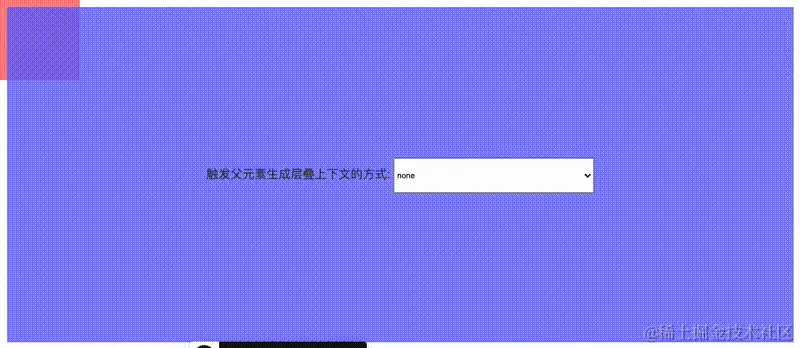
CSS 中,能够生成堆叠上下文的方法有非常多,方法如下(参考自 MDN):
- 根元素 (HTML);
- z-index 值不为 "auto" 的绝对/相对定位;
- 一个 z-index 值不为 "auto" 的 flex 项目 (flex item),即:父元素 display: flex|inline-flex;
- opacity 属性值小于 1 的元素(参考 the specification for opacity);
- transform 属性值不为 "none" 的元素;
- mix-blend-mode 属性值不为 "normal" 的元素;
- filter 值不为 “none” 的元素;
- perspective 值不为 “none” 的元素;
- isolation 属性被设置为 "isolate" 的元素;
- position: fixed;
- 在 will-change 中指定了任意 CSS 属性,即便你没有直接指定这些属性的值;
- -webkit-overflow-scrolling 属性被设置 "touch" 的元素;
- backdrop-filter 值不为 “none” 的元素
自定义属性
<style>
  ul {
    display: flex;
    justify-content: space-between;
  }

  li {
    width: 50px;
    height: 50px;
    border-radius: 50%;
    background-color: var(--bgColor, #000);
  }

  li:nth-child(1) {
    --bgColor: #f00;
  }

  li:nth-child(3) {
    --bgColor: #fc0;
  }

  li:nth-child(5) {
    --bgColor: #690;
  }
</style>

<ul>
    <li></li>
    <li></li>
    <li></li>
    <li></li>
    <li></li>
</ul>
第 2、4 个,使用了 var(--bgColor, #000) 中的黑色作为默认兜底值
CSS 自定义属性的传值方式
<style>
#g-element {
    width: 100px;
    height: 100px;
    background: var(--bgColor);
}
</style>
<div id="g-element"></div>- 通过 CSS 代码进行 CSS 变量值的传递。
:root {
    --bgColor: #000;
}

/* 或者 */
#g-element {
    --bgColor: #000;
    width: 100px;
    height: 100px;
    background: var(--bgColor);
}- 通过元素的 style 属性进行 CSS 变量值的传递
<div id="g-element" style="--bgColor: #000"></div>- 通过 JavaScript 改写 style 属性进行 CSS 变量值的传递。
const bgColor = '#000';
  document.querySelector('#g-element')
  .setAttribute('style', `--bgColor: ${bgColor}`);
@property 属性
语法
@property --property-name {
    syntax: '<color>';
    inherits: false; /* 是否允许继承 */
    initial-value: #fff; /* 初始值 */
  }

  div {
    color: var(--property-name);
  }
支持的 syntax 语法类型
- length
- number
- percentage
- length-percentage
- color
- <color#>: 接受逗号分隔的颜色值列表
- <length+>: 接受以空格分隔的长度值列表
- <length | length+>: 接受单个长度或者以空格分隔的长度值列表
/**
    - width: 100% -- 其中 100% 对应 percentage。
    - height: 95px -- 其中 95px 对应 length。
    - color: #fff -- 其中 #fff 对应 color。
    - border-radius: 10% 20% 30% 40% -- 其中 10% 20% 30% 40% 对应的是 percentage,但是这里是多个百分比取值,所以可以利用 + 号规则,表示为 percentage+,接受以空格分隔的百分比值列表
  */

  div{
      width: 100%;
      height: 95px;
      color: #fff;
      border-radius: 10% 20% 30% 40%;
      background-image: url(image.png);
      transition-duration: 1s;
  }
@Property 的优势
:root {
      --colorA: #fff;
      --colorB: #000;
  }

  div {
      width:100px;
      height:100px;
      background-image: linear-gradient(45deg, var(--colorA), var(--colorB));
      transition: 1s background-image;
      &:hover {
          --colorA: yellowgreen;
          --colorB: deeppink;
      }
  }
background-image 是没有动画效果的, 使用 @Property 进行改造
@property --houdini-colorA {
    syntax: '<color>';
    inherits: false;
    initial-value: #fff;
  }
  @property --houdini-colorB {
    syntax: '<color>';
    inherits: false;
    initial-value: #000;
  }

  .property {
      width:100px;
      height:100px;
      background-image: linear-gradient(45deg, var(--houdini-colorA), var(--houdini-colorB));
      transition:
        1s --houdini-colorA,
        1s --houdini-colorB;

      &:hover {
          --houdini-colorA: yellowgreen;
          --houdini-colorB: deeppink;
      }
}div {
width: 200px;
height: 200px;
border-radius: 50%;
background: conic-gradient(
yellowgreen,
yellowgreen 25%,
transparent 25%,
transparent 100%
);
transition: background 300ms;
}
div:hover {
background: conic-gradient(
yellowgreen,
yellowgreen 60%,
transparent 60.1%,
transparent 100%
);
}@property --per {
syntax: '<percentage>';
inherits: false;
initial-value: 25%;
}
div {
width: 200px;
height: 200px;
border-radius: 50%;
background: conic-gradient(
yellowgreen,
yellowgreen var(--per),
transparent var(--per),
transparent 100%
);
transition: --per 300ms linear;
}
div:hover {
--per: 60%;
}解决动画合成问题
利用 CSS 实现一个抛物线效果,像是这样
<style>
  div {
    animation:
      translateX 3s infinite linear,
      translateY 3s infinite cubic-bezier(.55, 0, .9, .4);
  }

  @keyframes translateX {
      0%,
      20% {
          transform: translateX(0);
      }
      80%,
      100% {
          transform: translateX(280px);
      }
  }

  @keyframes translateY {
      0%,
      20% {
          transform: translateY(0);
      }
      80%,
      100% {
          transform: translateY(280px);
      }
  }

</style>
<div></div>预想中的抛物线动画,并没有出现,只有单个的向下动画,在于后定义的translateY 的效果覆盖了在之前定义的 translateX的效果
使用 @property 重构
<style>

@property --x {
  syntax: '<length>';
  inherits: false;
  initial-value: 0;
}

@property --y {
  syntax: '<length>';
  inherits: false;
  initial-value: 0;
}

div {
    width: 20px;
    height: 20px;
    background: #000;
    border-radius: 50%;
    transform: translate(var(--x), var(--y));
    animation:
        translateX 3s infinite linear,
        translateY 3s infinite cubic-bezier(.55, 0, .9, .4);
}
@keyframes translateX {
    0%,
    20% {
        --x: 0;
    }
    80%,
    100% {
        --x: 280px;
    }
}
@keyframes translateY {
    0%,
    20% {
        --y: 0;
    }
    80%,
    100% {
        --y: 280px;
    }
}
</style>
<div></div>
数学函数
calc 运算函数
div {
    width: calc(100% - 80px);
}- + 和 - 运算符的两边必须要有空白字符 比如,calc(50% -8px) 会被解析成为一个无效的表达式,必须写成calc(8px + -50%)。
- * 和 / 这两个运算符前后不需要空白字符,但如果考虑到统一性,仍然推荐加上空白符。
- calc() 支持与 CSS 变量混合使用
calc 中的加减法与乘除法的差异
{
    font-size: calc(1rem + 10px);
    width: calc(100px + 10%);
}
可以看到,加减法两边的操作数都是需要单位的,而乘除法,需要一个无单位数,仅仅表示一个倍率
{
    width: calc(100% / 7);
    animation-delay: calc(1s * 3);
}
calc 嵌套
{
  width: calc(100vw - calc(100% - 64px));
}
此时,内部的 calc() 函数可以退化写成一个括号即可
{
  width: calc(100vw - (100% - 64px));
}
calc 内不同单位的混合运算
- px
- %
- em
- rem
- vh
- vw
- vmin
- vmax
不要将长度单位和非长度单位混合使用
{
    animation-delay: calc(1s + 1px);
}
calc 搭配 CSS 自定义变量使用
<div class="g-container">
    <div class="g-item" style="--delay: 0"></div>
    <div class="g-item" style="--delay: 1"></div>
    <div class="g-item" style="--delay: 2"></div>
</div>
通过 HTML 的 Style 标签,传入 --delay 变量,在 CSS 中直接使用它们
.g-item {
    animation: rotate 3s infinite linear;
    animation-delay: calc(var(--delay) * -1s);
}

@keyframes rotate {
    to {
        transform: rotate(360deg);
    }
}
calc 搭配自定义变量时候的默认值
var 的第二个参数是默认值
.g-item {
    animation-delay: calc(var(--delay, 10) * -1s);
}
比较函数
min()、max()、clamp() 都可以配合 calc 一起使用。
div {
    width: max(50vw, calc(300px + 10%));
}
calc 和相应包裹的括号可以省略,因此,上述代码又可以写成
div {
    width: max(50vw, 300px + 10%);
}
clamp(MIN, VAL, MAX) 其实就是表示 max(MIN, min(VAL, MAX))。