svg
图形
- 矩形
- 圆形
- 椭圆
- 线条
- 折线
- 多边形
矩形
- 矩形html
<svg height="100%" width="100%" xmlns="http://www.w3.org/2000/svg">
  <rect width="250" height="50" stroke="#673ab7" stroke-width="2" fill="transparent" />
</svg>
- 圆角矩形
增加了rx/ryhtml<svg height="100%" width="100%" xmlns="http://www.w3.org/2000/svg"> <rect rx="10" ry="10" width="250" height="50" stroke="#673ab7" stroke-width="2" fill="transparent" /> </svg>
圆形
html
<circle cx="25" cy="75" r="20" stroke="red" fill="transparent" stroke-width="5"/>椭圆
html
<ellipse cx="75" cy="75" rx="40" ry="15" stroke="red" fill="transparent" stroke-width="5"/>直线
html
<line x1="10" x2="50" y1="110" y2="150" stroke="orange" stroke-width="5"/>css与svg 的桥梁 - class
html
<svg height="100%" width="100%" xmlns="http://www.w3.org/2000/svg">
  <rect class="rect"/>
</svg>
css
.rect {
  width: 250px;
  height: 50px;
  stroke: #673ab7;
  stroke-width: 2;
  fill: transparent;
}
特性
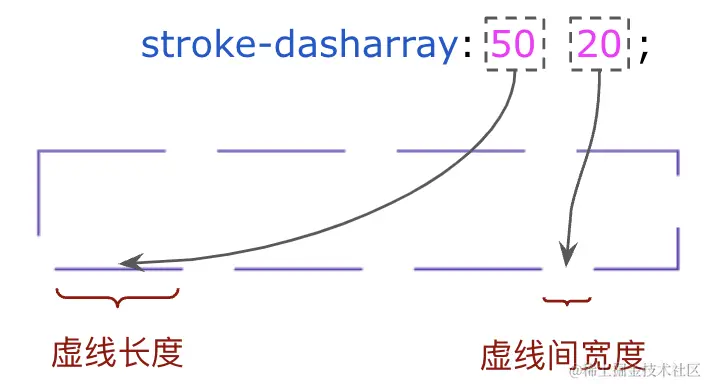
stroke-dasharray
一组数组,没数量上限,每个数字交替表示边框与间隔的宽度 / stroke-dash-array
TIP
在 CSS 中可以利用 dashed 关键字。但是,每段虚线的长度、每段虚线线段的长度是无法控制的,在 SVG 中利用 stroke-dasharray 就可以进行控制。
html
<svg xmlns="http://www.w3.org/2000/svg">
  <rect class="rect rect1"/>
</svg>
<svg xmlns="http://www.w3.org/2000/svg">
  <rect class="rect rect2"/>
</svg>
<svg xmlns="http://www.w3.org/2000/svg">
  <rect class="rect rect3"/>
</svg>
css
svg {
  width: 250px;
  height: 50px;
  margin-bottom: 20px;
}
.rect0 {
  width: 100%;
  height: 100%;
  stroke: #673ab7;
  stroke-width: 2;
  fill: transparent;
}
.rect1 {
  stroke-dasharray: 10 10;
}
.rect2 {
  stroke-dasharray: 30 30;
}
.rect3 {
  stroke-dasharray: 50 20;
}
stroke-dashoffset
边框线的偏移量

仔细看 3 个图形,边框形状是一致的,就是边框的起点不一样,而这,就是 stroke-dashoffset 的作用: 负数是往右移动,正数往左移动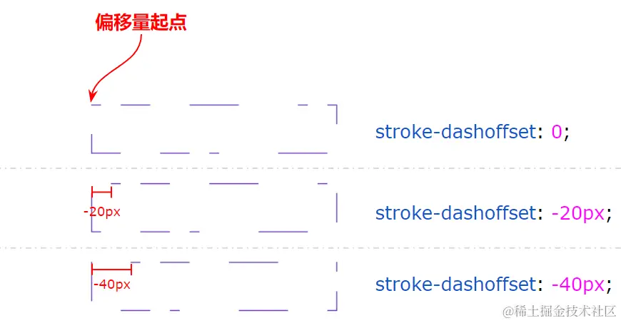
动画
hover
html
<style lang="scss">
.container {
  position: relative;
  width: 250px;
  height: 50px;
  .rect {
    width: 250px;
    height: 50px;
    stroke: #673ab7;
    stroke-width: 1px;
    fill: transparent;
    transition: .5s ease-in-out;
    stroke-dasharray: 100 500;
    stroke-dashoffset: 225;
  }
  .text {
    position: absolute;
    inset: 0;
    transition: .3s;
    transition-delay: .6s;
  }
}

.container:hover {
  .rect {
    stroke: deeppink;
    stroke-dasharray: 600 0;
    stroke-dashoffset: 475;
    stroke-width: 3px;
  }

  .text {
    background: deeppink;
    color: #fff;
  }
}
</style>
<div class="container">
  <svg height="100%" width="100%" xmlns="http://www.w3.org/2000/svg">
    <rect class="rect" />
    <div class="text">Line Animations</div>
  </svg>
</div>loading
html
<svg class="circular" viewbox="25 25 50 50">
    <circle class="path" cx="50" cy="50" r="20" fill="none" />
</svg>
css
.circular {
  width: 100px;
  height: 100px;
  animation: rotate 2s linear infinite;
}
.path {
  stroke-dasharray: 1, 200;
  stroke-dashoffset: 0;
  stroke: #000;
  animation: dash 1.5s ease-in-out infinite
}
@keyframes rotate {
  100% {
    transform: rotate(360deg);
  }
}
@keyframes dash {
  0% {
    stroke-dasharray: 1, 200;
    stroke-dashoffset: 0;
  }
  50% {
    stroke-dasharray: 89, 200;
    stroke-dashoffset: -35px;
  }
  100% {
    stroke-dasharray: 89, 200;
    stroke-dashoffset: -124px;
  }
}
在最开始的阶段,使用 stroke-dasharray: 1, 200,表示 1px 间隔 200px,并且 stroke-dashoffset: 0;,所以最开始只有一个 1px 的点
后来 stroke-dasharray变为 89,200,stroke-dashoffset变为 -35px,所以最开始由一个 1px 的点,慢慢变大
stroke-dasharray: 89, 200 表示 
通过 animation,让线段在这两种状态之间不断循环变换。而 stroke-dashoffset 的作用则是将线段向前推移,配合父容器的 transform: rotate() 旋转动画,使得视觉效果上线段是一直在向一个方向旋转